Monday, December 01, 2014

Round the World Blog Hop

I have been invited by Clare Smith of www.claresmith.blogspot.com to participate in this Round the World Blog Hop.  Clare is a Kiwi dyer and textile artist, and I love the work she is doing with dyeing fabric while in situ in a gallery.  The rules of the Blog Hop are that we have to answer some questions about our work, show what we are doing, and then nominate some other bloggers to do the same.

Here are the questions:

1. What am I working on? 

OK, this is a tricky one.  I have moved away from quilt art towards makings textile-related things for sale in the local Textile Emporium - in other words, I have gone from making stuff to look at to making stuff to sell. However......I have become very interested in eco printing, dyeing with plant material and Slow Cloth.  What is Slow Cloth?  It's my own offshoot of Slow Fashion, where I will create either accessories (eg cushion covers, scarves, bags) or garments from plain natural fibres (eg cotton, linen, silk) that I have transformed by slow methods such as shibori, dye bundling with plant material, solar dyeing, rust dyeing and so on.  

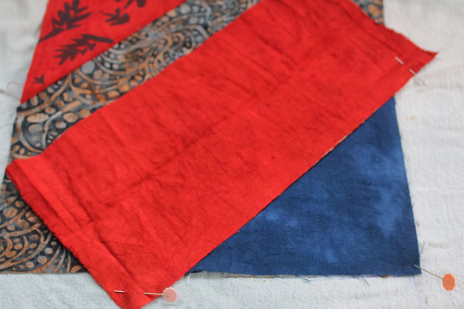
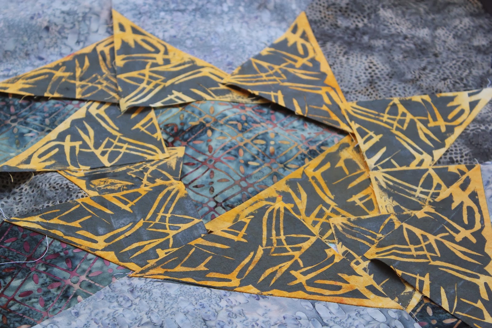
I am only just starting this journey, so haven't much to show yet except these 2 scarves:


2. How does my work differ from others of its genre? 

The Slow Fashion movement is still in its infancy, and slow cloth is even newer.  In many ways, though, it is older, as this is how cloth used to be made - when craftsmanship and artisans were valued and there was no mass production.  As far as I know, there are only a few textile artists embracing this style.

3. Why do I create what I do? 

Because it interests me.  I have always followed my own interests with cloth and dyeing.  My work has never been popular or trendy, but that doesn't worry me. 

4. How does my creative process work?

I sneaked a look at Clare's answer and positively chortled!  I have also gone to art school, but at an advanced age, so I write nothing down!  It is all in my head and I prefer it that way because it changes constantly.  I do my best thinking when I am lying down.  I think things through in quite a lot of detail this way.

Because I am somewhat late at getting this done, having been at work (unpaid) at the Textile Emporium all day and because I didn't read about it properly in advance, I am going to nominate 2 other bloggers without warning them - I hope they will be able to spare a few minutes to participate.

1. Liz Plummer  from Newport in South Wales.  Liz is a fellow blogger from the Quilting Arts blog ring who kindly invited me to stay for a few days when I was in the UK in 2010.  Liz is also a textile artist doing exciting things with fabric.

2. Dijanne Cevaal who flits from France to Australia and back again.  Dijanne was an early dyeing influence and will be known to many.  She will probably curse me for this as she is producing a book and doing a squillion other things.  However, I wanted to include her as she has also been a huge influence on my work - I love just about everything she does.  I stayed with Dijanne in the south of France when I was on my overseas trip and had a blast.  


Thursday, November 06, 2014

It's been a long time coming....

...I have been neglecting my blog in favour of posting on Facebook.  However, this blog has a long history and I have made many friends through it so I don't want to lose that.  Here's what I'm up to at present:-


Back to my dyeing roots.  I have just been accepted as a member of TOTE (The Oamaru Textile Emporium, based down in the Historic Precinct) so I now need to ramp what I have available for sale.

In addition, I have another class of EQ7 Beginners' Patchwork starting on 7th November (US time) - details are here http://academyofquilting.com/class-schedule-2/online-class-details/?classesID=106.  If you have Electric Quilt software, this class will help you get the best from your programme.  If not, and you love designing quilts, it's worth having EQ7.  Being able to test designs, colours and layouts before cutting into any fabric is hugely beneficial for quilters, given the price of fabric these days.

I'll post more soon about the things I'm making for TOTE and my new direction towards slow cloth.

Thursday, March 13, 2014

The reveal

 Those of you who have been following the last few posts about my new project will remember that the objective was to tone down the corner accents of hand dyed fabric.  Above is the original layout (not stitched).
And here is layout #2 - slightly different angle, sorry - but you can see what a difference the screen printing has made to the way the quilt looks.  I am much happier with it now.   I did not attempt to reproduce the original layout - I just started from scratch and tried to ensure that there was a pattern with the corners, and that no 2 pieces were the same where they adjoin.
The dogs are, of course, completely familiar with this sort of thing and don't mess it up :-).

I welcome your comments!  Please tell me which version you prefer, and why.

Tuesday, March 11, 2014

A new project! Part 4

 One thing I've learned with screen printing is that paints don't behave like dyes.  Mix red, blue and yellow dyes, and you get brown.  Mix these as paints, and you get dark grey.  Not what I wanted.  I have had some comments about my approach to colour mixing :-) ...sometimes you have just to do it.  There are no exact recipes for this.
 Plan B was to make an orangey colour. At least red and yellow worked here.
 The design I made for the black triangles was a simple stylized sun.

 This was quick and easy to do.
 For the navy triangles, I did a far more difficult design.  This involved printing most of the triangle, so it was pretty tricky to line up.
 It didn't always work perfectly, and I had to touch up some triangles with a cotton bud, adding paint to areas that were missed.
To avoid getting paint on the rest of the block, I used a piece of waste fabric as a shield.
 Here's the results - the black with gold suns above...
..and the overprinted navy triangles below.  

I will probably leave the grey triangles as they are.  Next step is to lay all the blocks out on the floor, and see how they look.

Friday, March 07, 2014

A new project! (part 3)

For the Rust Orange triangles, I decided on a quite different design.  It started out to be leaves but it looks more trees.  I find it helps to not overthink your designs.   I started by drawing the shapes, but when I began to cut, they came out differently.

Here's the design on Contact paper on the screen.

 I had grey paint left over, but wanted it to look a little different, so I added black and red....
 ..and some yellow...

 and a bit of blue.  Because I love colour, it does not matter to me if the paint in completely mixed or not.
And here is the first print.  Again, perfection is not required - it is the overall look I'm aiming for.  Once the paint is dry and ironed, I'll post a group shot of the triangles, and then start on the Navy bits.

Wednesday, March 05, 2014

A new project! (Part 2)

I pondered for a while about how I could improve the look of my blocks.  One option was to unpick all the fabric I wasn't happy with, and replace it with a different, more muted colour.  However, I hit upon a solution that meant I didn't have to go to all that trouble.

I really like how the quilt that inspired me was made with all patterned fabric - not something I usually do.  Also, I have fabric paint for screen printing, so decided that I would screen print designs onto the fabric triangles  I wasn't happy with in order to tone them down.  Here's what I did:

Firstly, I taped up my screen so that the visible part was the same size as the fabric triangles. I am going to work on the Butterscotch triangles first.
 Then I mixed black and white fabric paint.  I wasn't too worried about it mixing perfectly.
Then, I cut little bits of Contact paper into shapes and stuck them on the screen.  Other colours will have other designs.  This design only has to screen print the 12 Butterscotch triangles.
 Here's the sample I did.  Too much paint, but apart from that, I was happy with it.  However, my first attempt on an actual block wasn't successful.  It was very hard to see through the screen to line it up properly and I ended up with paint all over the edge of the batik fabric.  I had to wash it all off.  This was a case for registration marks!

I measured how far my screen triangle was from the edges of the screen, and marked that.  I also marked the outline of where the screen would sit. I tested this again before using a block, and it worked fine.  The fabric was fastened to the background with flat quilting pins.

 Here's my first attempt.  I am not concerned about irregularities or smudging - batiks, by their nature, often do not have precise patterns.
And here are the 12 printed pieces.  I'll use different colours and designs for the Rust Orange triangles and probably also the Navy.  Photos to come of these later.

A new project! (Part 1)

I have been putting off making new quilts for a variety of reasons that I won't bore you with.  I have now got my head in a better space, and decided to try a grey quilt.  I found some lovely batiks :
 and then I hand dyed some fabric that matched with the colours in the batiks.
This is the design I decided on - I wanted something simple, where the beauty and colour of the fabrics could be displayed (and it didn't take me long to sew)
 I had no pattern, so worked out the sizes to best fit the fat quarters.  I decided to sew the blocks the easy way - with a square in the corner.  I also sewed another seam 1/2" in from the diagonal.
 Then I cut between the 2 lines of stitching...
 ..to produce one large block and one small block of half square triangles.  I will use these on the back.
 When I'd sewn all the blocks, I laid them out on the floor.  Hmmm. I wasn't totally happy with the result.  I felt the contrasting fabrics I'd added were too bright.  Way too bright.  What to do?  See part 2.


Thursday, February 27, 2014

Thinking but not doing

I'm certainly doing plenty of thinking about my quilting, though no actual doing is taking place.  The house is on the market and there are 2 Open Homes at weekends, so I've been reluctant to wallow in fabric and mess seeing as I have to constantly tidy it all up.  I'm frustrated by the long wait to get the house sold, which is making me grumpy.  Anyway, last post I showed you the brown batik fabrics and the accompanying hand dyes.  This is what they look like together:

and these are the accent colours that I've chosen to go with the browns. 


Now all I have to do is decide on the pattern, and actually do it !

BREAKING NEWS - my Screen Printing for Quilters online class starts tomorrow (February 28th) at the Academy of Quilting.  This is written especially for quilters and fabric artists, and requires no complicated chemicals or processes.  Screen printing is a way of adding different designs, shapes and textures to your work.


Wednesday, January 01, 2014

50 Shades of Brown

It's now 2014.  Yes, another year has disappeared.  This is always a time of reflection for me, looking both backwards and forwards.  In 2014, I want to do more stitching - stitching of all kinds.  Sewing, quilting, embroidery, knitting, crochet and maybe even rediscover macrame. Here's today's stitching effort - an apron made from jeans.

 Last week, I bought some batiks as I had an urge to make a batik quilt.  I bought a pack of 16 fat quarters in browns….

 …unusual for me, as I tend to like  a lot of colour.  Then I dyed calico in 16 different shades….
..ok, that's only 32 browns.  I am using writer's licence here!  I've married each batik up with a hand dyed piece, and will show you what I do with these as I progress.

Best wishes for a happy and abundant year ahead.