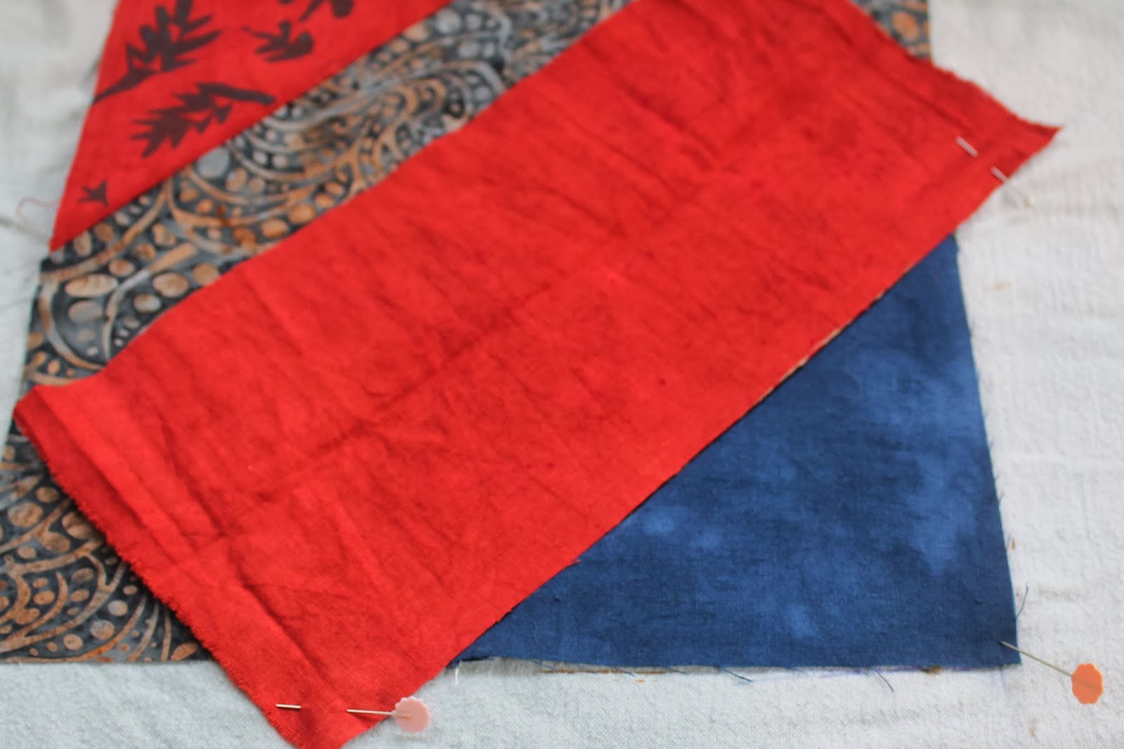
Plan B was to make an orangey colour. At least red and yellow worked here.
The design I made for the black triangles was a simple stylized sun.
This was quick and easy to do.
For the navy triangles, I did a far more difficult design. This involved printing most of the triangle, so it was pretty tricky to line up.
It didn't always work perfectly, and I had to touch up some triangles with a cotton bud, adding paint to areas that were missed.
To avoid getting paint on the rest of the block, I used a piece of waste fabric as a shield.
Here's the results - the black with gold suns above...
..and the overprinted navy triangles below.
I will probably leave the grey triangles as they are. Next step is to lay all the blocks out on the floor, and see how they look.


1 comment:
looking so good, the sun is a super design, and this is going to be great together. Cheers, Jean.
Post a Comment